


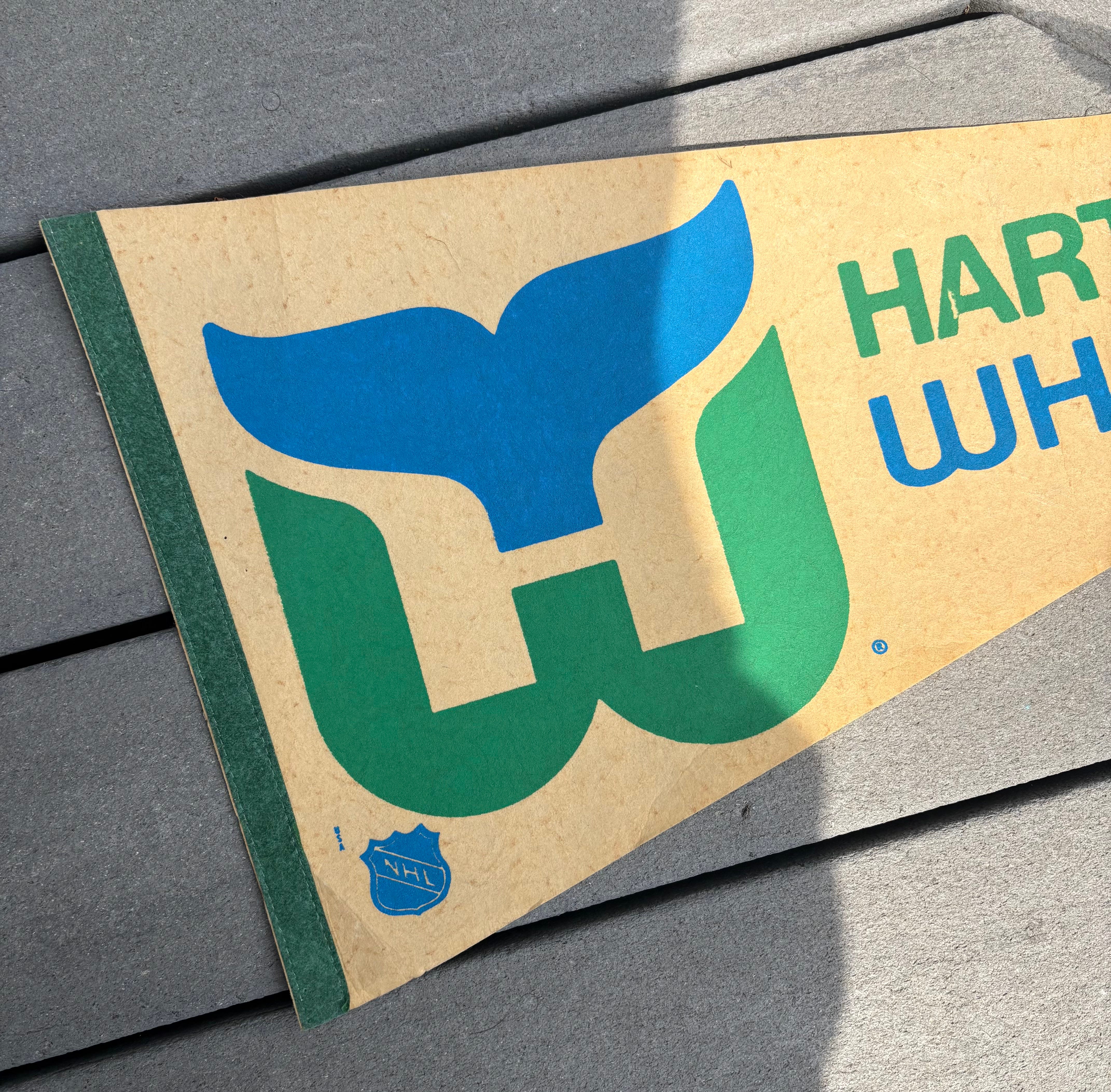
At a medical appointment a few weeks ago, while the nurse took my pulse, blood pressure, temperature, she asked me about work.
“So, what do you do?”
“I’m a graphic designer.”
I’ve learned over the years to always add the word “graphic” in front of designer. Otherwise they assume interior design, which is not at all what I do. I can’t even pretend to decorate my own house.
“Oh, cool, so what kind of stuff do you design?”
“Logos, branding, brochures, trade show graphics, websites… I’ve done it all.”
I’ve been working in design long enough I’ve really designed a bit of everything.
“What is your favorite thing to design?”
She got busy wrapping the blood pressure cuff around my arm.
“Logos, for sure logos.”
She sat on the stool in front of me, “Okay, this might get tight.”
“What is your favorite logo you’ve ever seen?”
“That’s easy, the Hartford Whalers. Without a doubt.”
“I don’t know that one.”
“The team is no longer there, they moved somewhere, maybe Florida?”
Turns out it was North Carolina. Much like the Minnesota North Stars move to Dallas, I can only imagine the pain the people of Hartford went through back in 1997.
The cuff released and she packed the machine away.
“Hartford Whalers, right?”
She grabbed her phone and searched for the logo.
“Is this it?”
She flipped her phone around and flashed the iconic blue and green logo. Blue whale’s tail, green W, the negative space between the two creating the H.
“That’s it!”
“Yeah, that is really great.”
“It’s a great use of negative space.”
Digging into it, the logo was designed by Peter Good in 1979 for $2,000. In today’s dollar, that’s just under $10,000. Which is still a steal for a high-profile logo. Even today it’s considered one of the best sports logos ever created. Bonus for me is that it’s for a hockey team.
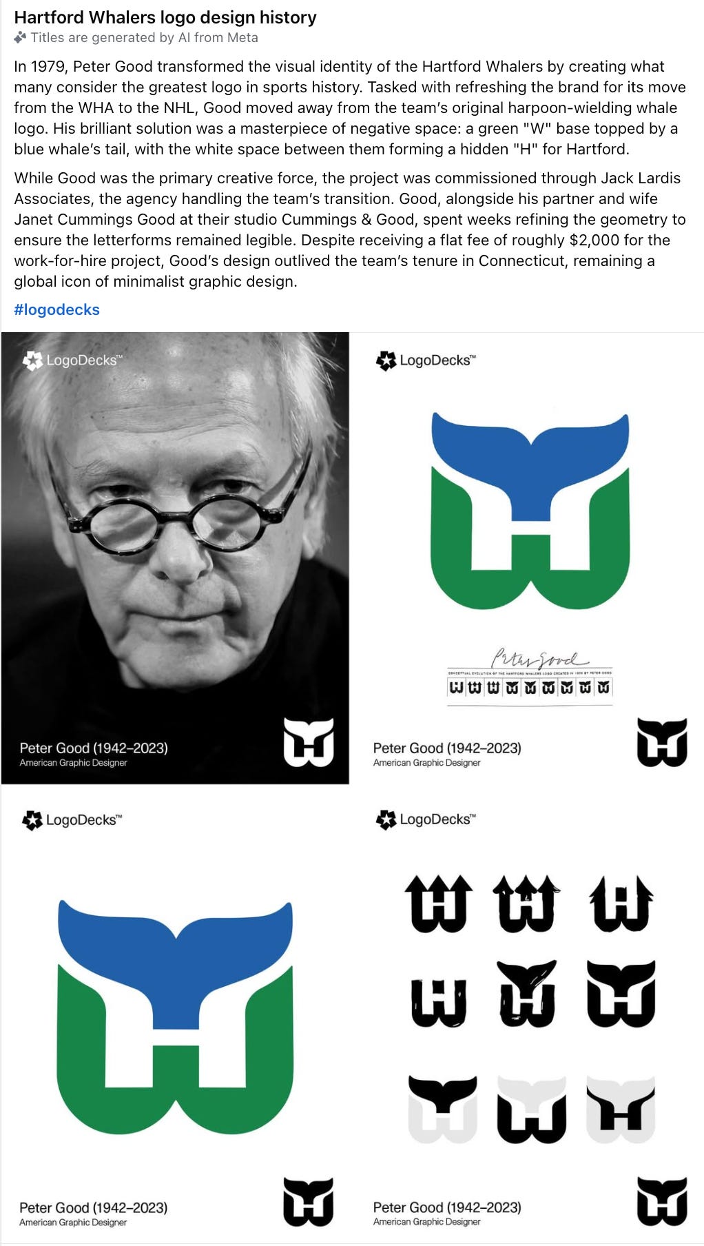
Not only does the logo show great white space, but it includes the H and a whale’s tale. It’s easy to reproduce, identifiable from a long distance or when used really small.
Like I wrote a few weeks ago, logos have a big job. They must stand out, communicate in a split second yet be simple enough to reproduce in large and tiny sizes.
Despite being a die-hard Minnesota North Stars fan, I had a Hartford Whalers pennant hanging on my wall through junior high and high school.
It should have been a sign that one day I’d be designing logos. Like this one!
Do you have a logo or branding project? Or do you want to talk about hockey? Reach out!
It’s pretty amazing! I didn’t see the H until you pointed it out. The whale tail got me. And the colors. Simple and striking! Cool.